EBY
Improving CTR and AOV through improved customer experience and elegant visuals.
Co-founded by Sofia Vergara, EBY is a direct-to-consumer, subscription-based underwear service for women. With over 20,000 customers, part of the subscription revenue business model donates 10% of proceeds to empower women out of poverty and into business through microfinance loans.
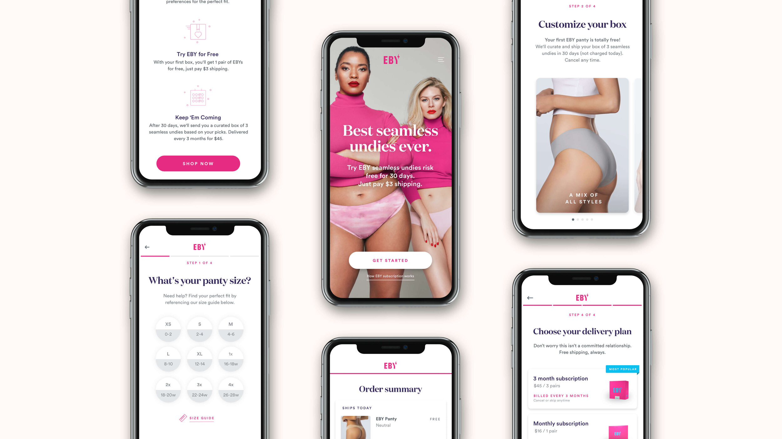
I partnered with the co-founders, brand, and engineering teams at EBY to help improve the user experience and reduce friction in the subscription funnel on the website by streamlining the purchase process. The primary goals were to increase the CR (Conversion Rate) and AOV (Average Order Value) by discovering areas to upsell customers in the checkout flow while creating an enjoyable purchasing experience.
UX Refinement & Research
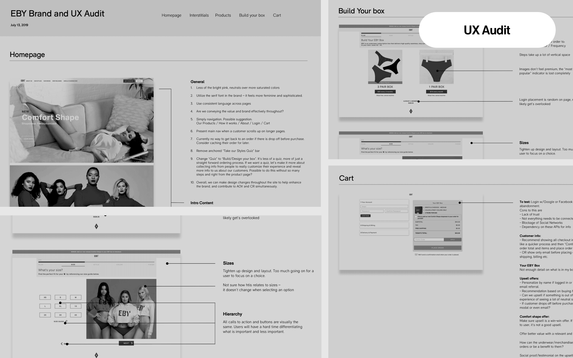
Leveraging existing data from customers and information from the EBY team, I compiled an audit of the existing UI to better understand the funnel process and user pain points. I identified visual and interaction problems with the product purchase flow and ran competitive audits on subscription underwear sites with similar experience models. There wasn’t a sample base doing subscriptions exceptionally well, and as an overall experience, most seemed to struggle with the same CX issues EBY was experiencing. The audit was widened to analogous brands with similar products or subscription models.
Design Exploration
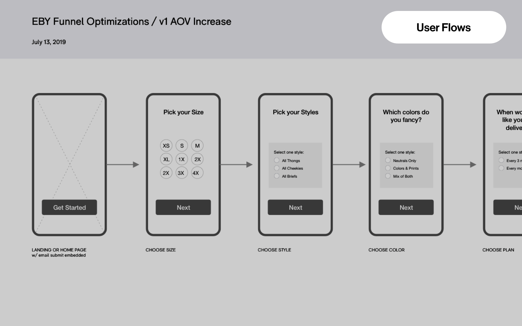
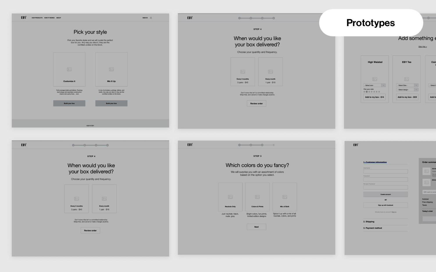
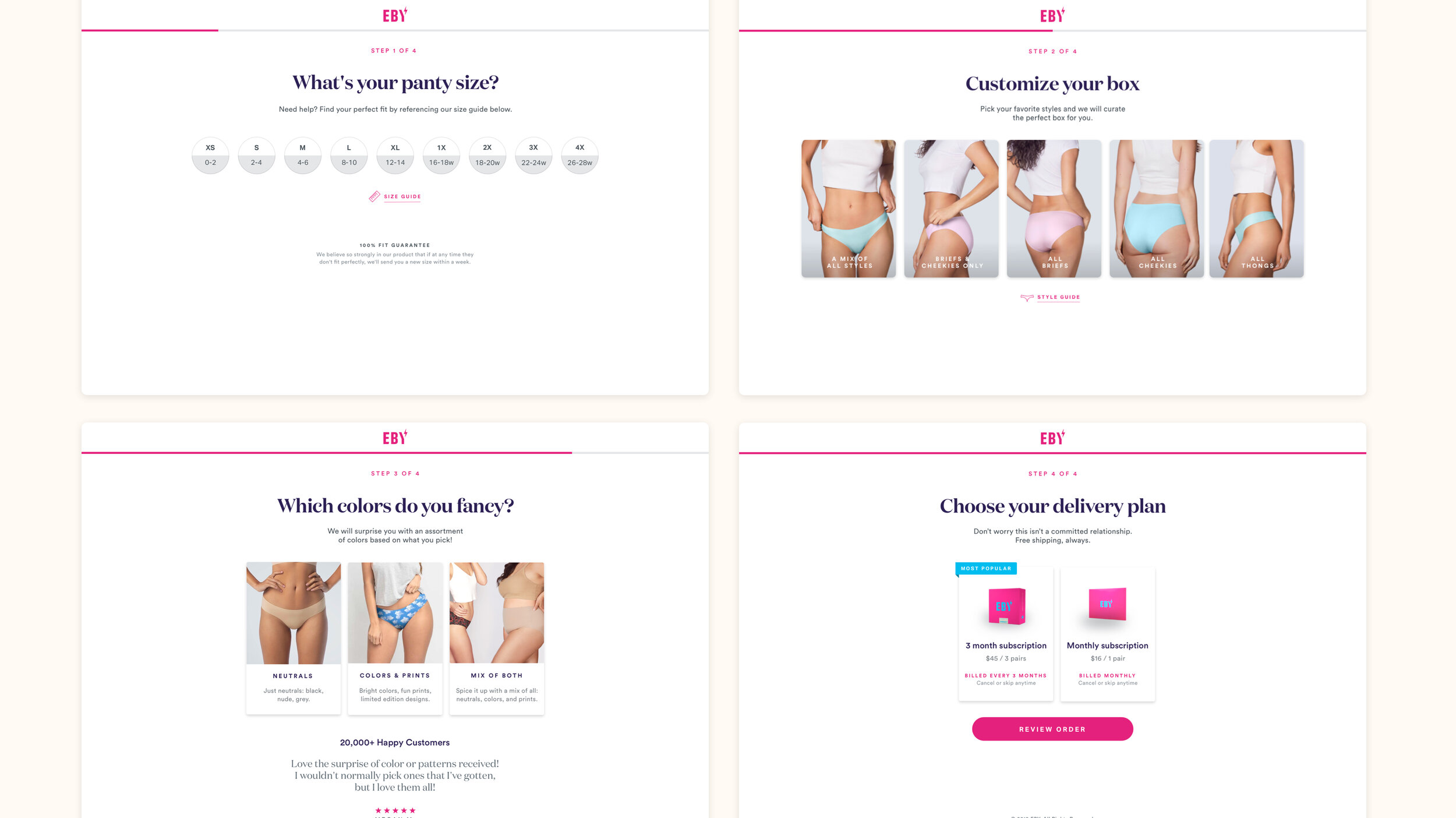
Moving into the design phase, we looked at various iterations of design directions, from the simplest type-only flows to more visually delightful options, highlighting the underwear styles in the subscription process. We also explored options that automatically moved customers through the process based on their selections at each step, requiring minimal input from customers.
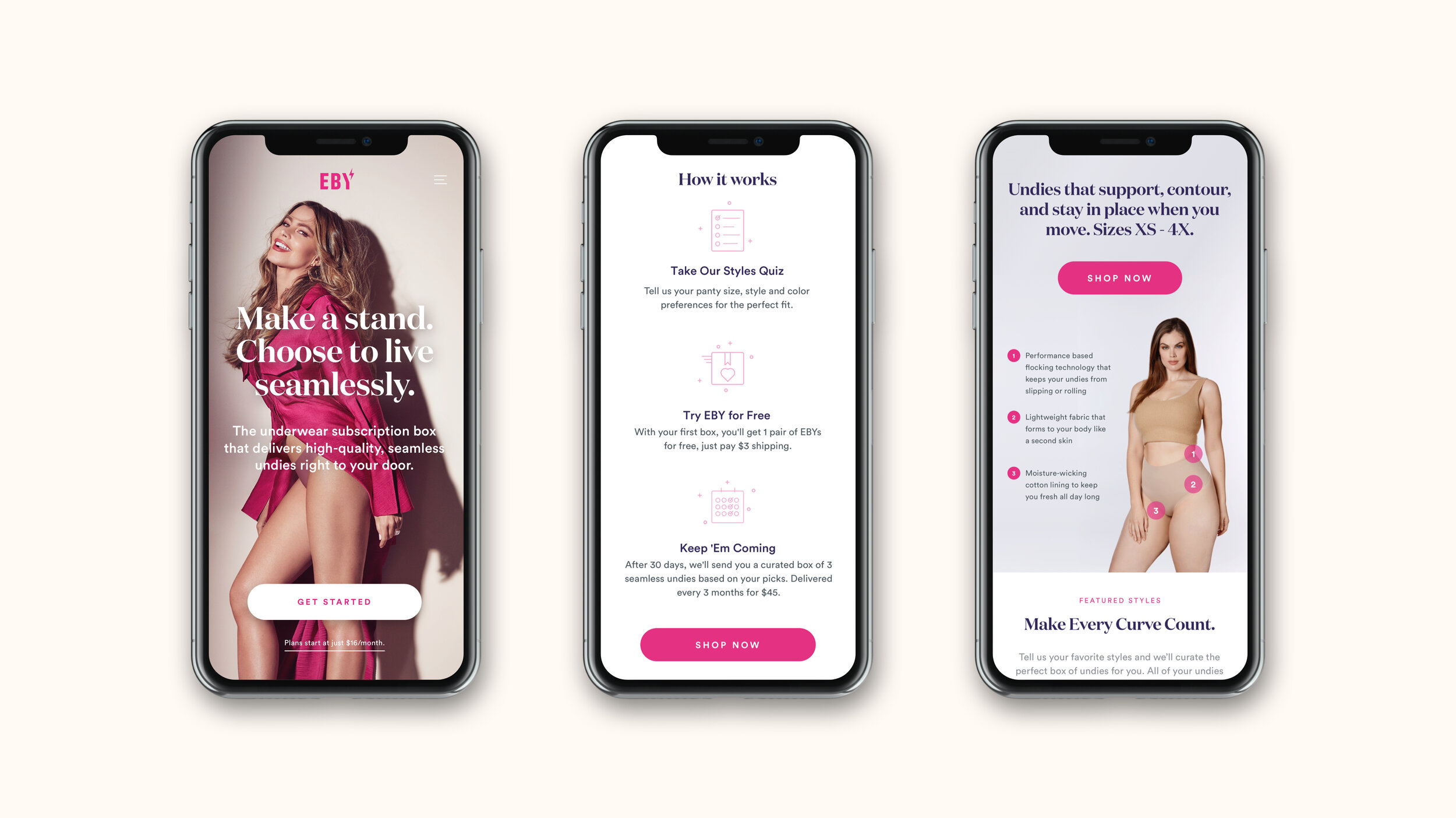
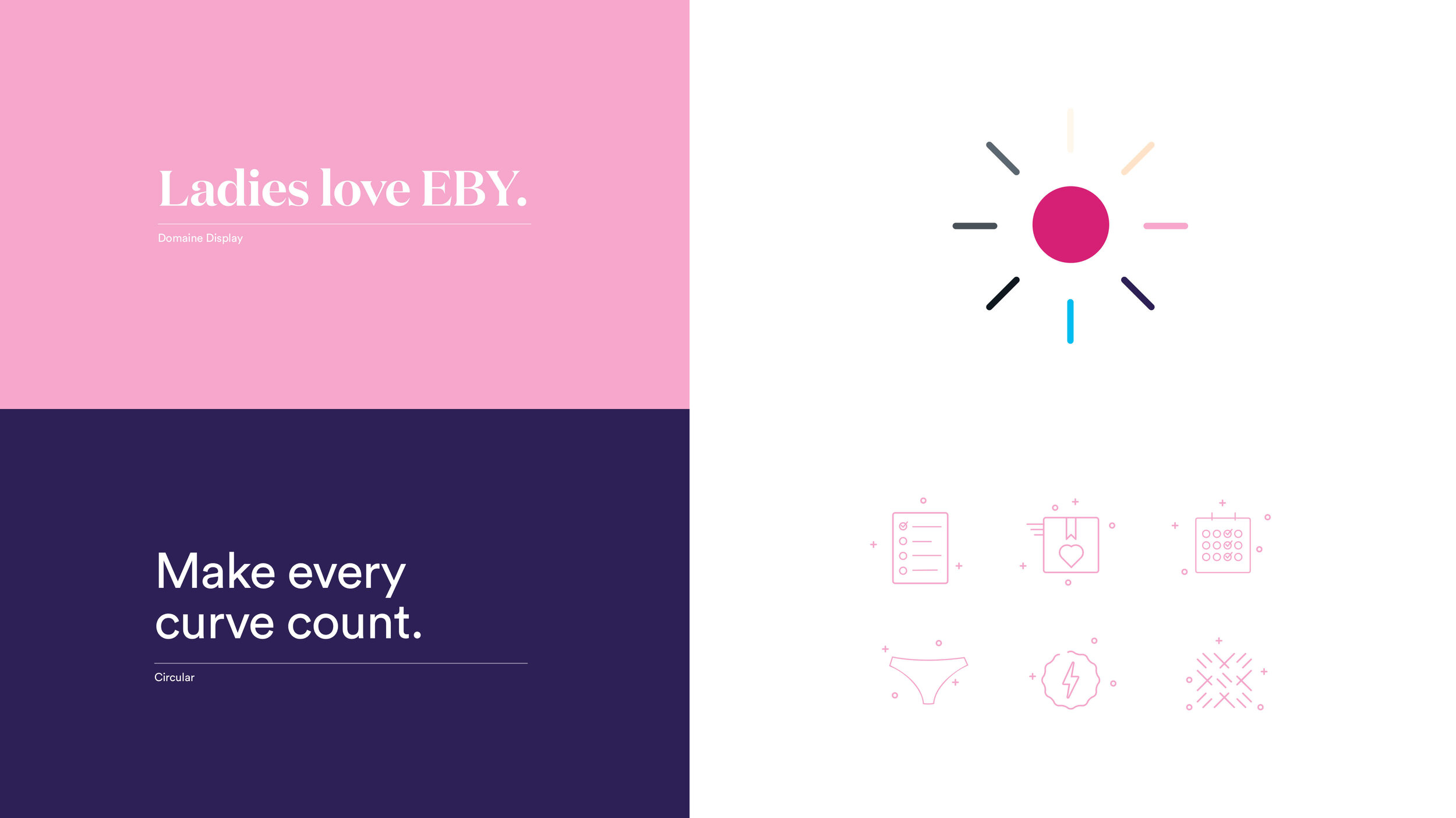
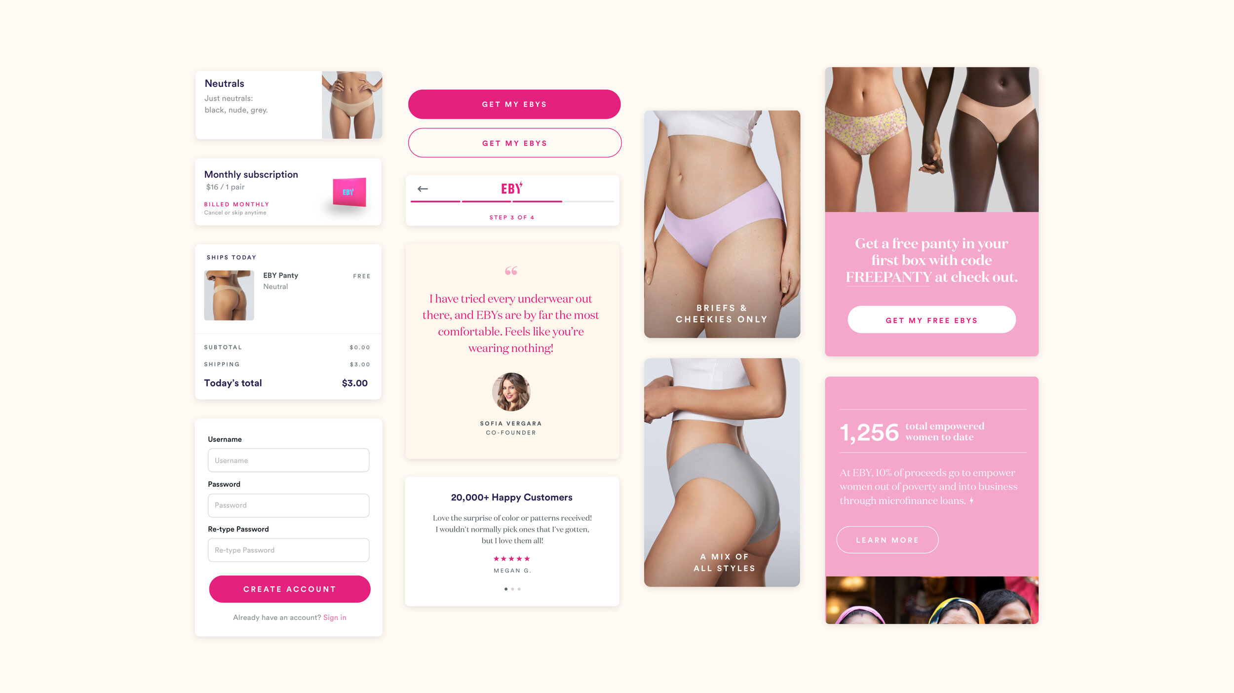
After refining the flows and moving into higher fidelity designs, we updated the typefaces used on the existing site to feel more elegant, on-brand, and less tech-centric. There was a focus on reducing the amount of the primary magenta color, which appeared almost everywhere. While we focused on mobile first, the site was designed to work across all devices. I evolved the visual design language into a cohesive system while ensuring the brand colors used were adjusted to pass accessibility on screen.
Revised Brand Elements
Typography Guide
Design Components
CRM Landing Pages
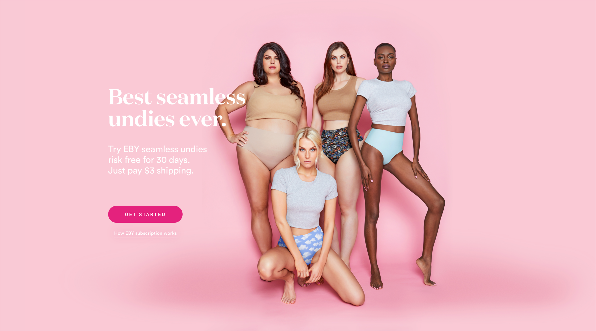
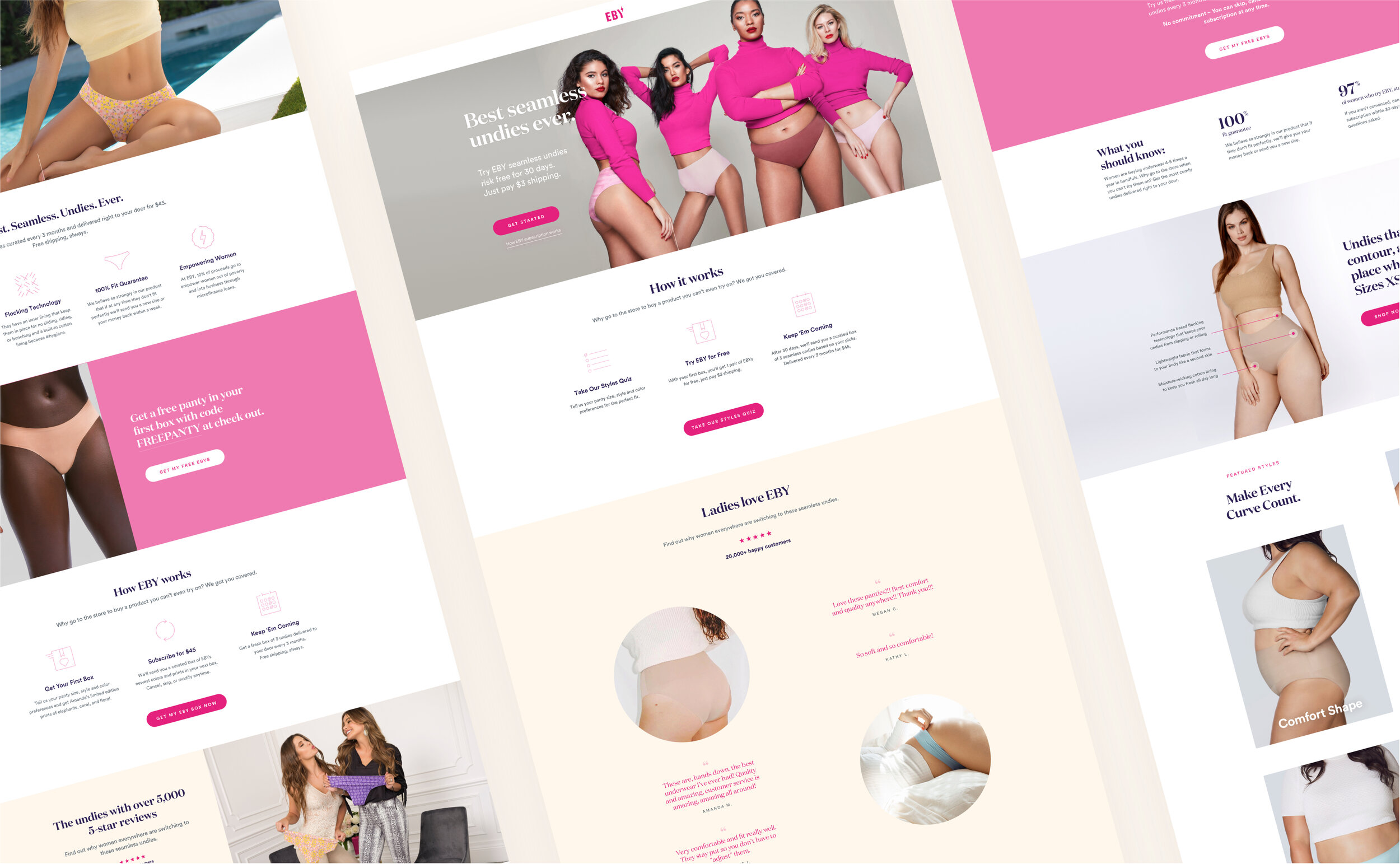
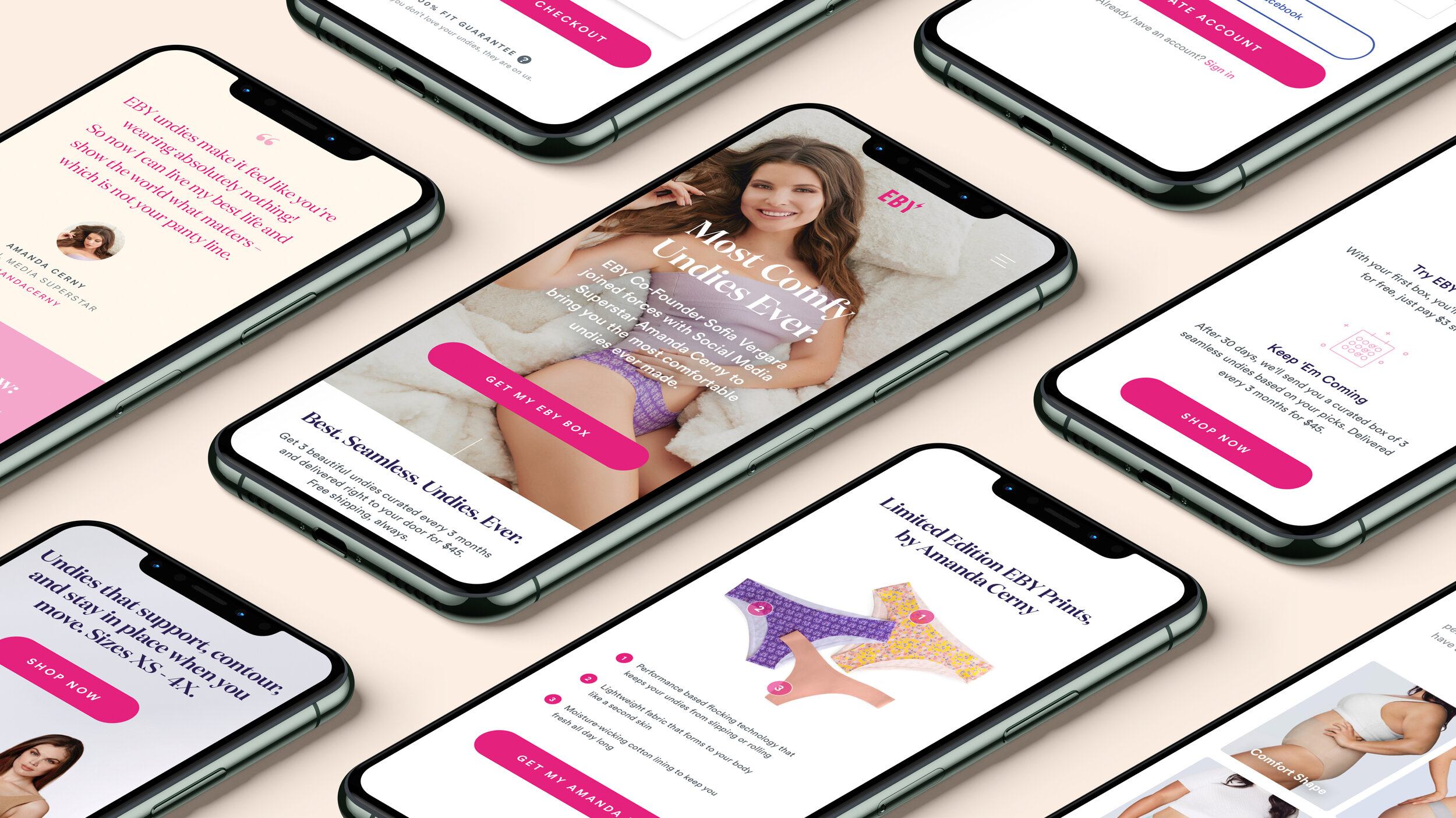
While updating the subscription flow, I redesigned the layouts and system for landing pages receiving traffic from ad campaigns and the limited edition styles pages. We elevated and introduced more concise language around the subscription model to the top of the page. After our research, we found this confusing for new customers who didn’t understand the company and how the products were sold. These latest updates will inform future design and content updates to the homepage and the rest of the website.
Role:
Brand & UX Audit
Analogous & Competitive Audits
Wireframes & Prototypes
UI Design
Responsive Web
